Module 4 Reading Questions
Question 1
Let’s say Cursor has just finished implementing a feature for you. What is the first thing you should do after this?
Click to see answer
1. You should always check, validate, and test what Cursor has done for you! This involves:- Reading the code diff and file changes to see if they make sense and align with your expectations.
- Checking the functional validity of your changes (whether visually or not).
Question 2
You would like to implement the favorites feature for the trivia application. What will change on the front-end? How about the back-end?
Click to see answer
The favorites page will mean we will need to add a button on the front-end page to allow users to favorite a question. `app/protected/TriviaButton.tsx`.We will need to set up a back-end route that allows us to save these questions that have been favorited into the Suapbase favorites table. app/api/favorites/route.ts.
Finally, we will also generate a separate front-end route that will allow users to display all their favorited questions: app/protected/favorites/page.tsx.
Question 3
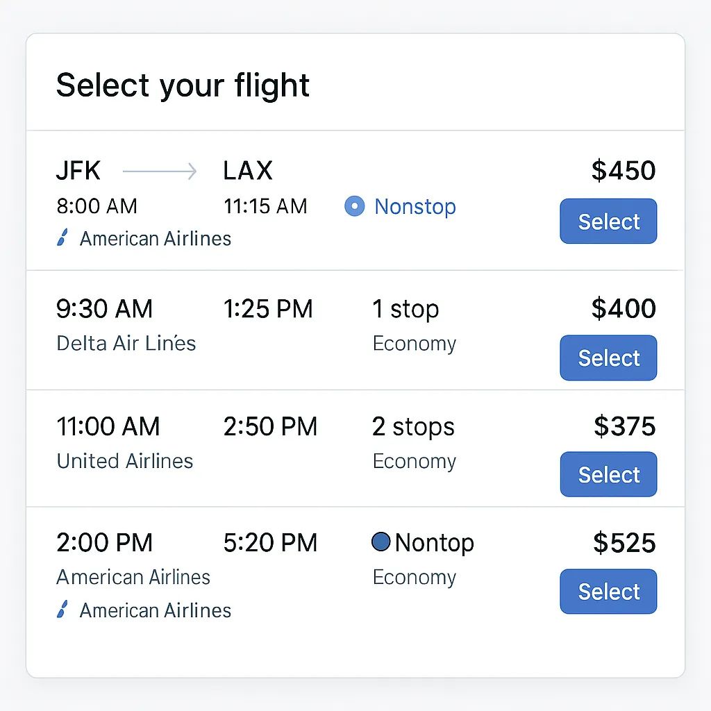
How might you improve the following UI?
Click to see answer
✅ 1. Fix Typo - 🔧 Correct "Nontop" → should be "Nonstop" in the 2:00 PM flight row.🎯 2. Improve Visual Hierarchy & Alignment
- 🧭 Align departure/arrival times and prices uniformly across all rows.
- 📏 Ensure consistent styling for airline info and icons (e.-g., only some rows use the airline logo icon).
💬 3. Add Key Travel Details
- ⏱️ Include total flight duration (e.g., “5h 15m”) — important for users comparing options.
- 🛄 Display baggage info (e.g., “carry-on only” or “includes checked bag”).
- 🛬 Show layover city names for flights with stops (e.g., “via Denver”).
🎨 4. Improve Accessibility & Interactivity
- 🔍 Increase text contrast for smaller labels like “Economy”.
- 👆 Expand the clickable area of the “Select” button (especially for mobile users).
- 🌗 Consider dark mode support or colorblind-friendly alternatives for stop indicators.
🧠 5. Enhance Comparison Features
- 📊 Allow sorting (e.g., by price, duration, number of stops).
- ✅ Add a “Compare” checkbox for users to view flights side-by-side.
- 🟢 Use color-coded or icon-based badges to indicate “nonstop”, “1 stop”, etc., at a glance.
Question 4
Rank the following prompts in terms of how effective they are at improving the previous flight UI/UX.
A. “Make the UI feel more premium and polished.”
B. “Add in logos for all airlines. DO not make the non-stop option look like a radio button. Make each flight card consistent and show origin and destination. Make each flight option more visually appealing and consistent.”
C. “Add airline logos next to the airline names and use consistent font sizes and spacing across all flight details.”
D. “Make the UI generally more consistent and visually appealing.”
Click to see answer
B “Add in logos for all airlines… Make each flight card consistent…” ✅ Most effective — clear, specific, addresses multiple UI issues (logos, layout, consistency, visuals).
C “Add airline logos… use consistent font sizes and spacing…” ✅ Focused and actionable — targets visual consistency and branding, though narrower than B.
A “Make the UI feel more premium and polished.” ⚠️ Vague — suggests direction but lacks concrete guidance.
D “Make the UI generally more consistent and visually appealing.” ⚠️ Too generic — hard to act on without specifics.